Implementing an art project in a public space has its challenges. Aside from enduring the elements and working around weather forecasts, one also needs to learn to deal with the audience and be responsive to their view point -at times even evolving the composition to suit their perspectives. Marking up work zone, setting up bollards, keeping the site tidy and ensuring the safety of pedestrians and other users of the space become paramount and adds to the artist responsibilities and project timeline.
Having now completed a street art project; I thought it would be beneficial to record and share my experiences and also take this opportunity to provide a brief about the inspirations and considerations behind the artwork.
Background
City of Greater Dandenong is nestled in the foothills of the Dandenong Ranges and is situated on the lands that belong to the Wurundjeri and Bunurong tribes of the Kulin Nation. Since its humble beginning as pastoral land in 1850’s, the city now has a population of 150,000 plus and plays a key role in Melbourne’s economy. The city is considered most culturally diverse in Victoria with residents from 157 different birthplaces calling the city home. In addition to other nationalities, the city hosts a large and growing regional population of people from Indian, Pakistani, Bangladeshi, Fijian and Sri Lankan backgrounds.
The Little Indian Cultural precinct in Dandenong has a number of Indian businesses and specialist traders including fashion shops, eateries, grocery outlets and general retail. This street art project is part of the Council’s plan to create a more authentically ‘Indian’ experience and enliven the streetscape to showcase the color and vibrancy of the cultures of the region.
The Project Brief
Putting together an art proposal is a drag, especially when the success rate is low. Earlier this year I had spent a substantial amount of time and effort in putting together a few proposals which were unsuccessful and therefore when the project brief came out in June; I was tempted to let this one go.
However, from my perspective, the brief had all the right words. It talked about the artwork needing to be to be vivid, colorful, contemporary, engaging, unifying and inclusive of the cultural diversity of the precinct. As these are the key elements that I strive for in my art practice; I couldn’t resist what was on offer and ended up submitting a proposal for this project. Luckily this time it worked out! Myself and another local artist, Yogeshwari, were successfully commissioned to paint a pole each on Foster Street.
Inspirations for the artwork
Unlike the west, where the color choices are more defined, the people from the subcontinent are not afraid of using color. Use of a bold color palette for decorating the body, clothing, artifacts or architecture is an integral part of the ‘Indian’ way of life and dictated my choice of palette for this project.
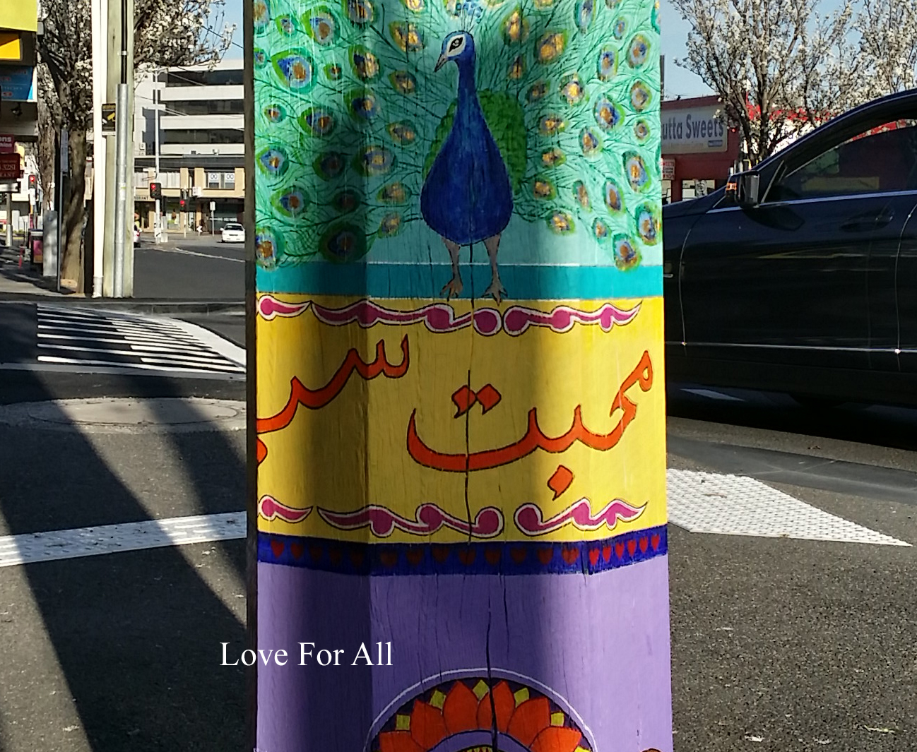
The artwork is titled ‘Peace and Love’. While the overall composition is inspired by the indigenous ‘truck art’ of Pakistan, I have combined a number of other design elements from Pakistan, India, Sri Lanka, Bangladesh and Fiji to meet the unifying and inclusive character of the brief. These patterns are then supplemented with various colloquial slogans from the Urdu language to emphasize the title of the piece.
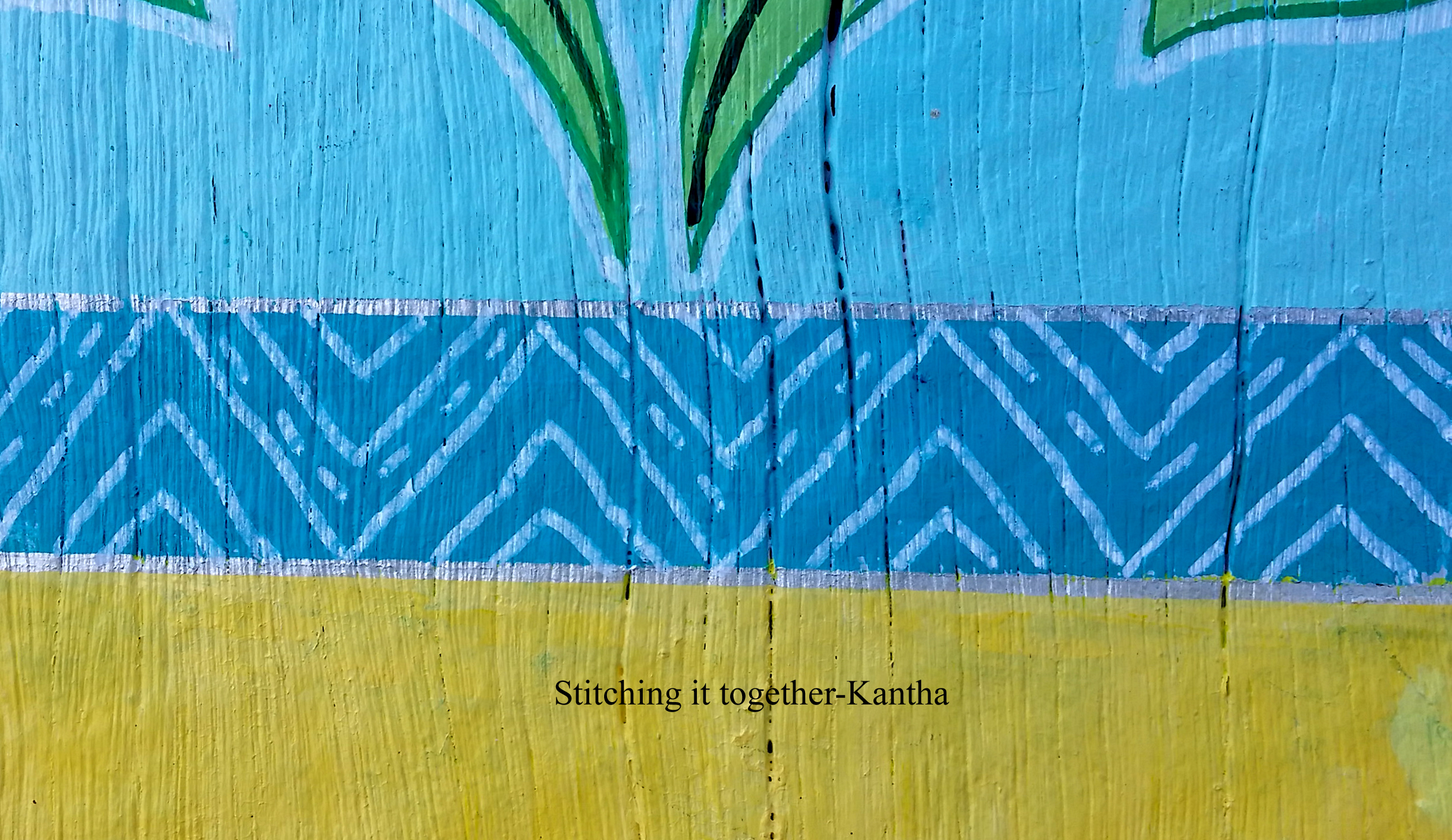
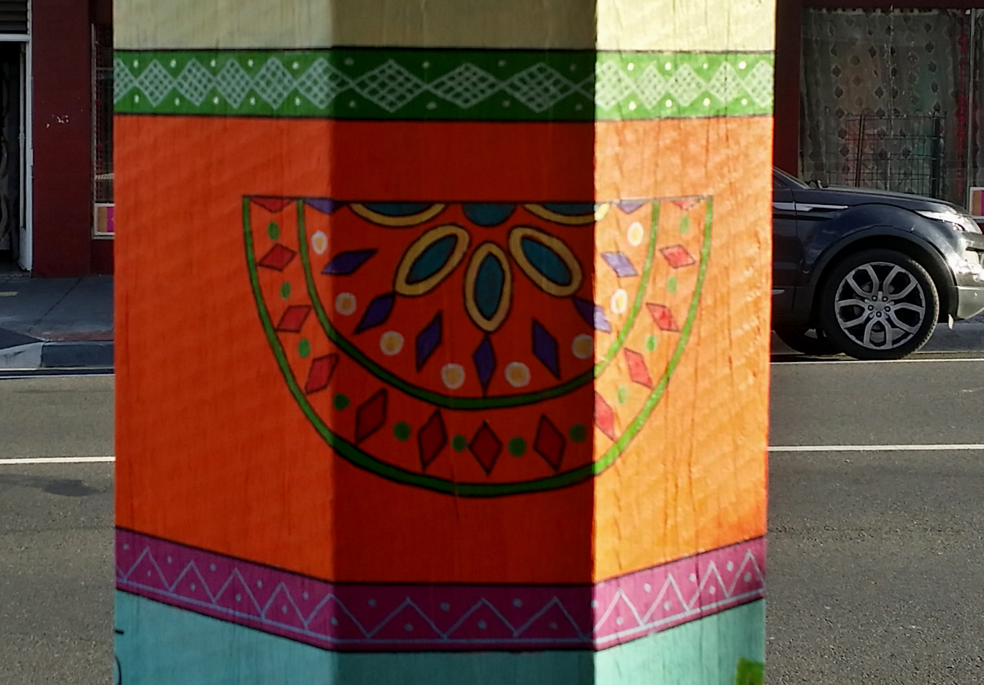
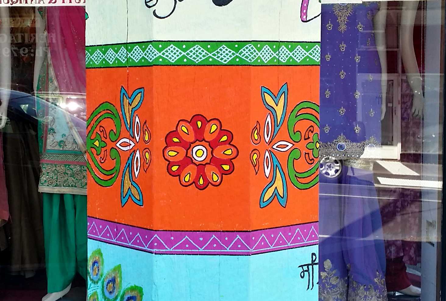
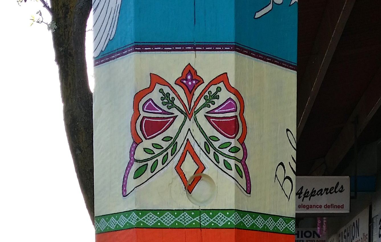
The pole is divided into bands of different colors, which are bound together with narrow borders of varying sizes. These narrow bands are inlayed with dashed line pattern which represents the traditional “Kantha” stitch embroidery. Kantha is one of the oldest forms of embroidery and the technique is still practiced in West Bengal to create family heirlooms which are then passed on from one generation to the other. I have used the kantha concept to ‘bind’ or “stitch” together the various layers of the artwork.
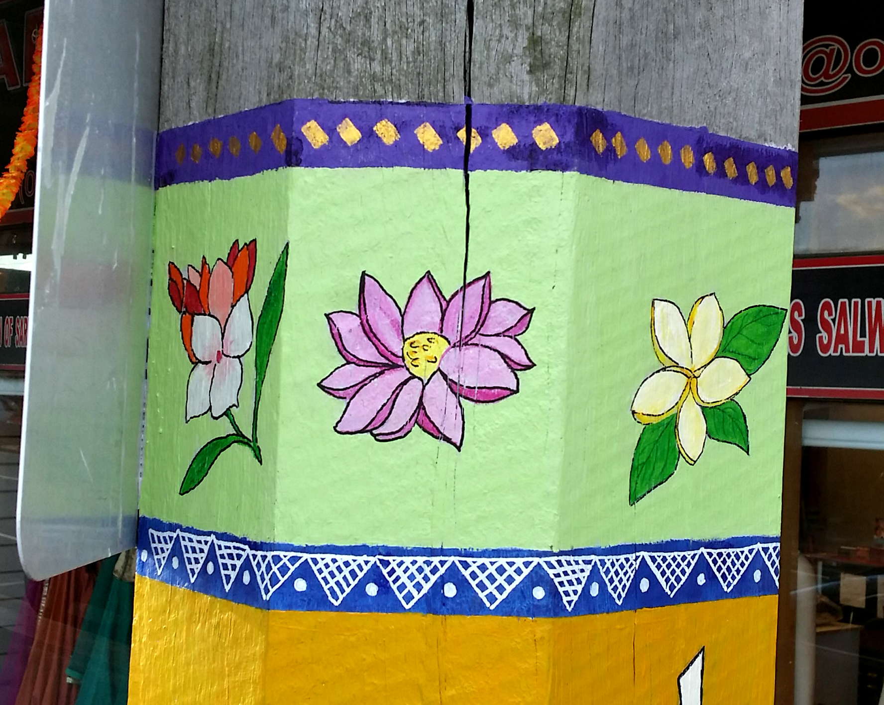
The top band comprises of the national and popular flowers of different counties including Fiji (Tagimoucia), India (Lotus), Pakistan (Jasmine), Bangladesh (Water Lilly) and Sri Lanka (Blue water lily).
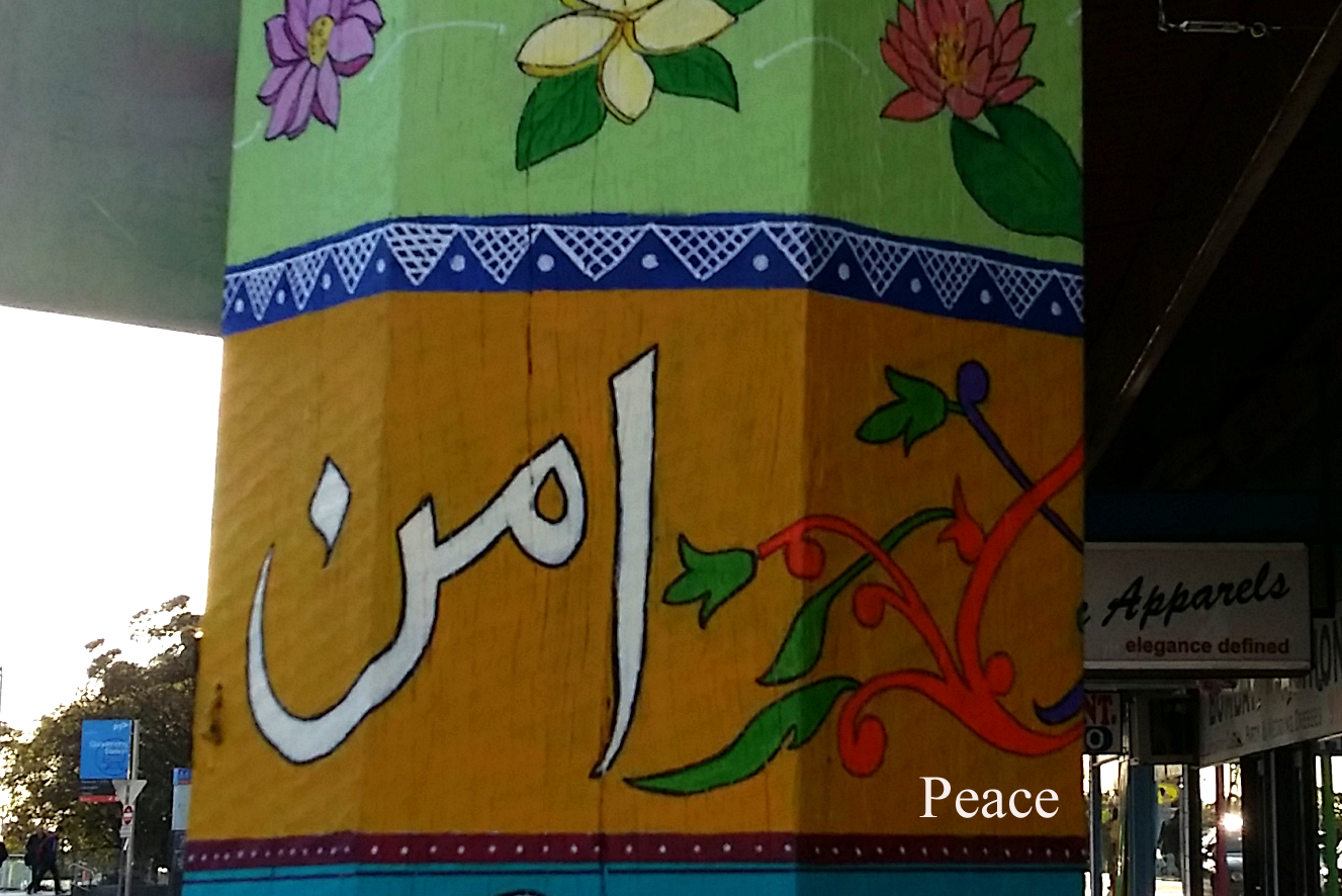
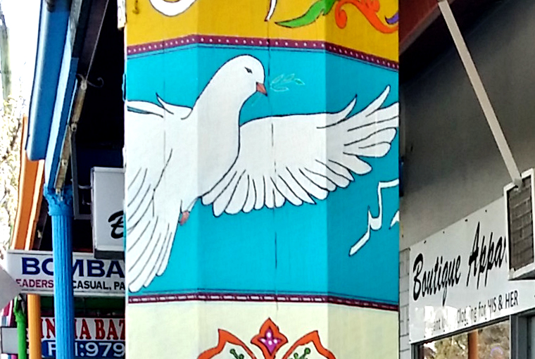
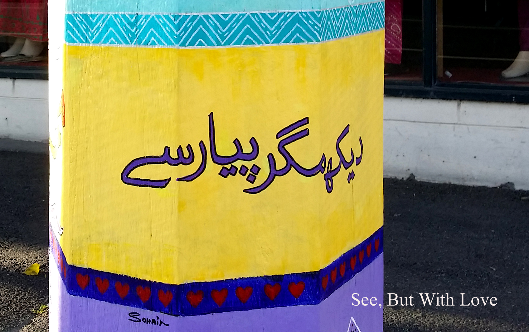
The second tier comprise of the Urdu word ‘Aman’ (Peace) and is followed below by the peace dove symbol on one side and a phrase ‘Puppu Yaar Tung Na Kar’, which literally means ‘ Mate don’t bother or disturb)’. Similarly lower down I have written the phrase “Pyar sub say” (Love for all) on one side and “Dekh magar pyaar say” (See but with love) on the other.
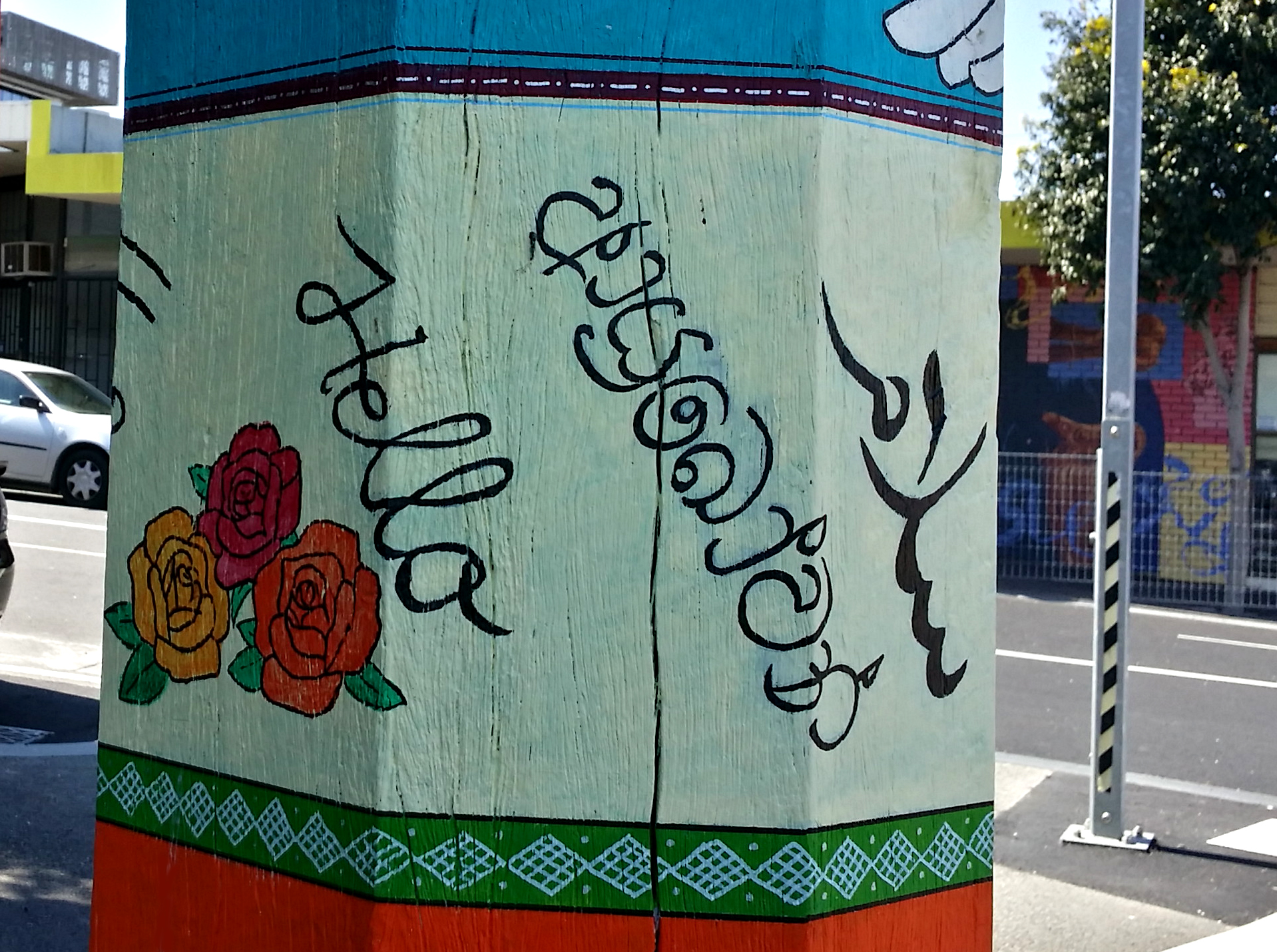
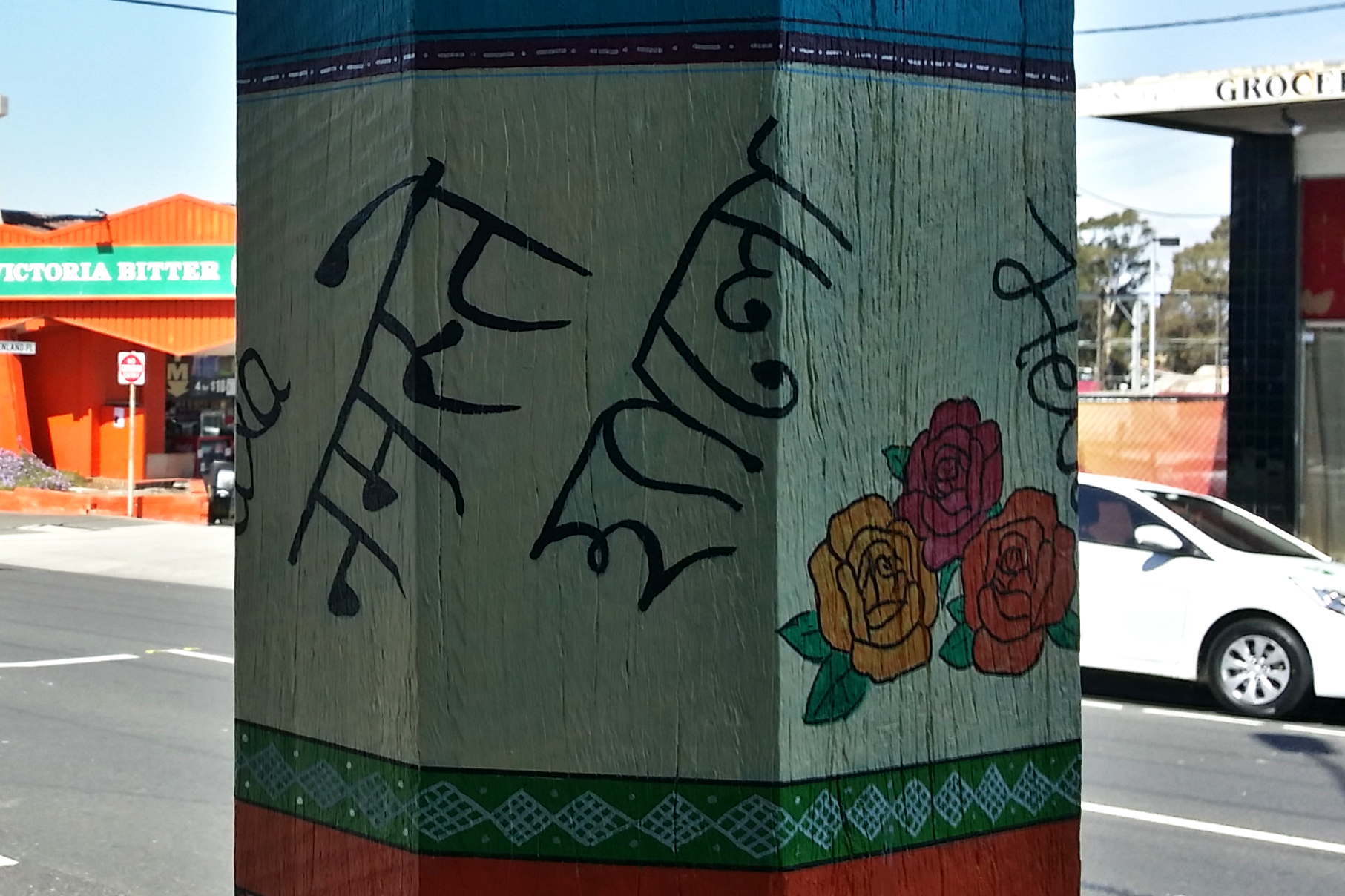
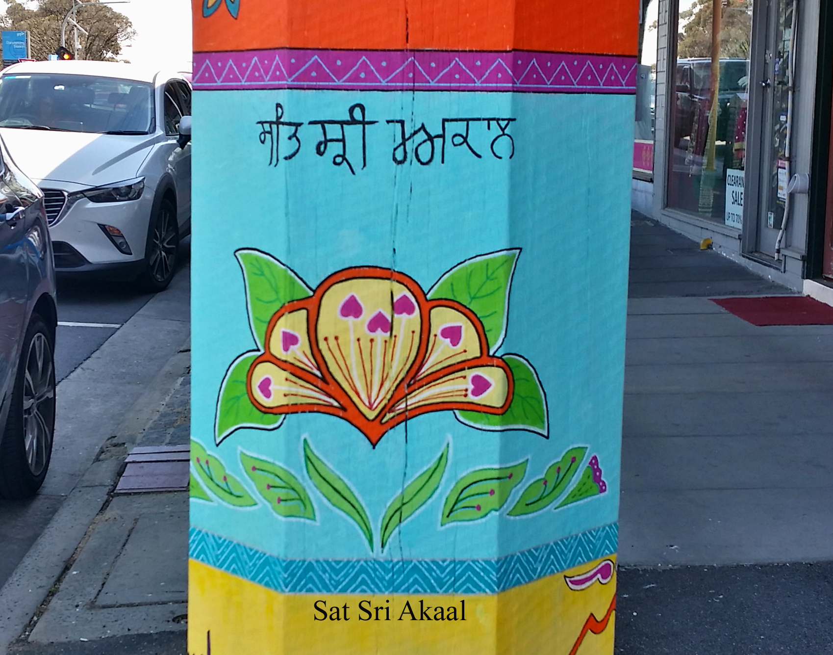
The middle band comprises of the words ‘Hello’ in English, Urdu (Salam), Sanskrit (Namaste), Bengali (Hyalo), Fijian (Bulla), Sinhalese (Ayubowan) and Punjabi (Sat Sri Akaal). These slogans have been strategically located at eye level to greet the people passing by the pole.
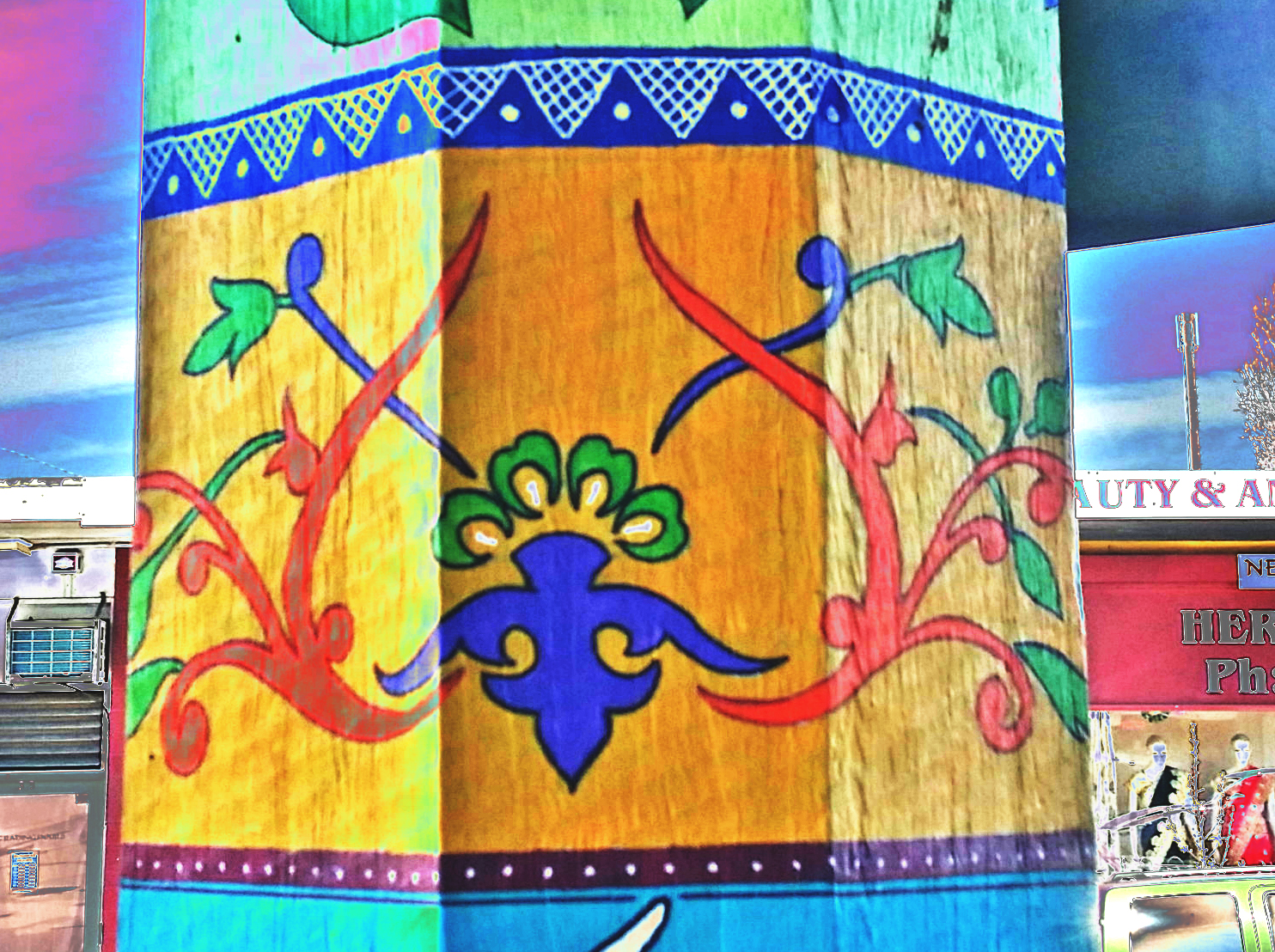
I have introduced a number of truck art inspired motifs as fillers and links in various locations to maintain the overall aesthetic appeal of the composition.
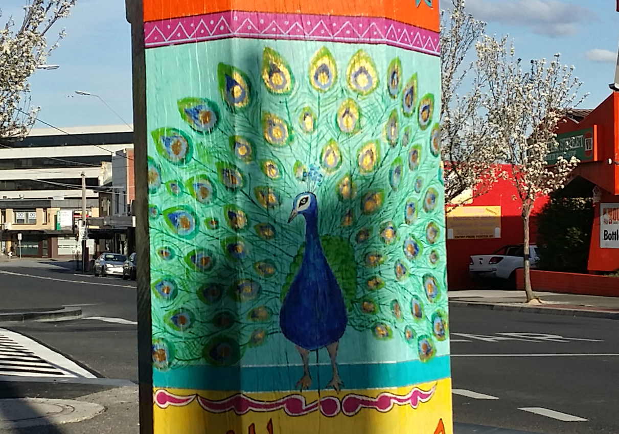
One of the key elements of this composition is the dancing peacock. Peacocks symbolise various things in different traditions - nobility, holiness, guidance, protection and watchfulness are among the few virtues attributed to the bird. The Peacock holds an important place in local Indian culture and forms a key element of traditional folk art. One of the key challenges of this section was to find the right orientation where natural sun light could bounce off the golden colored feathers, to give the composition a subtle glow.
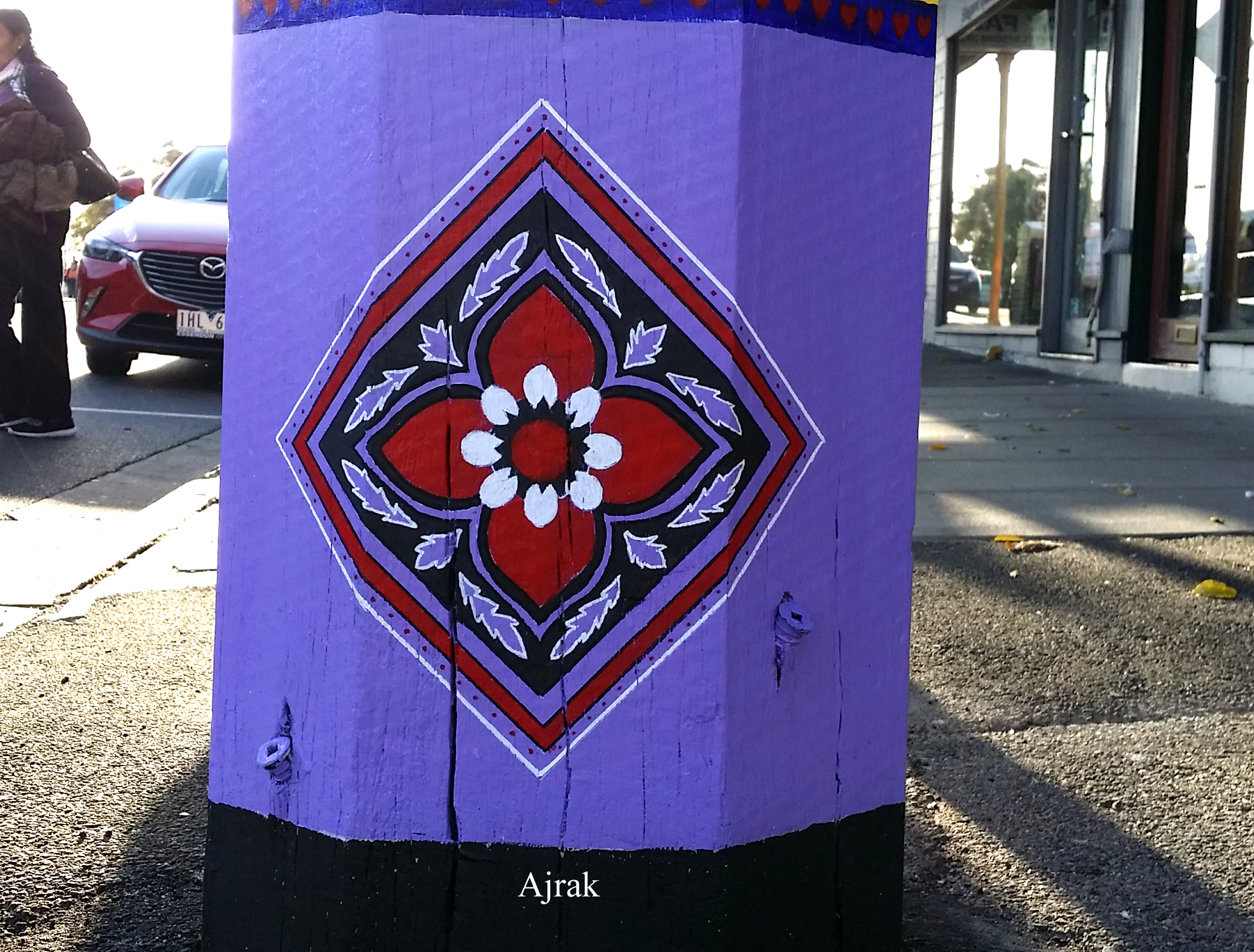
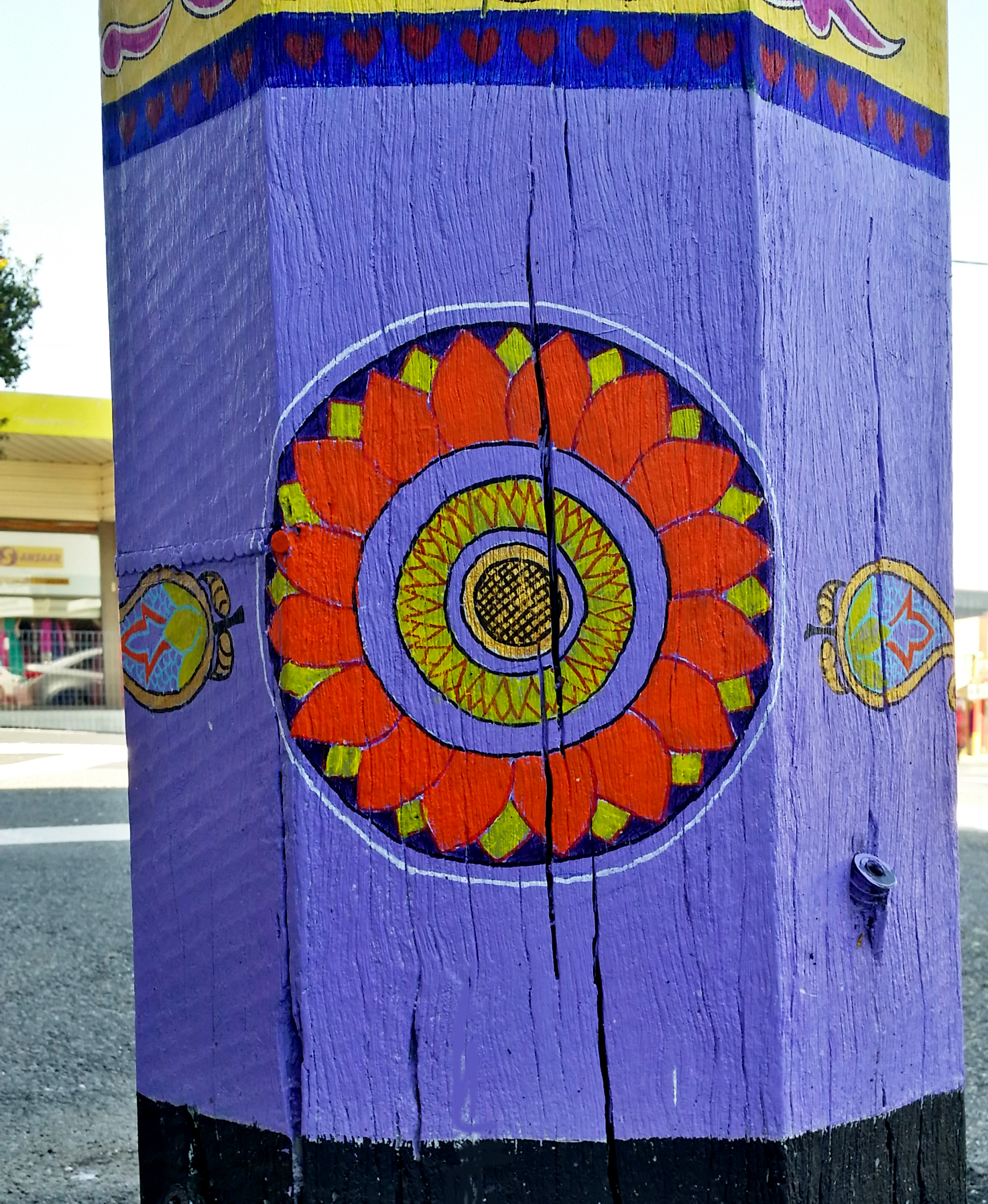
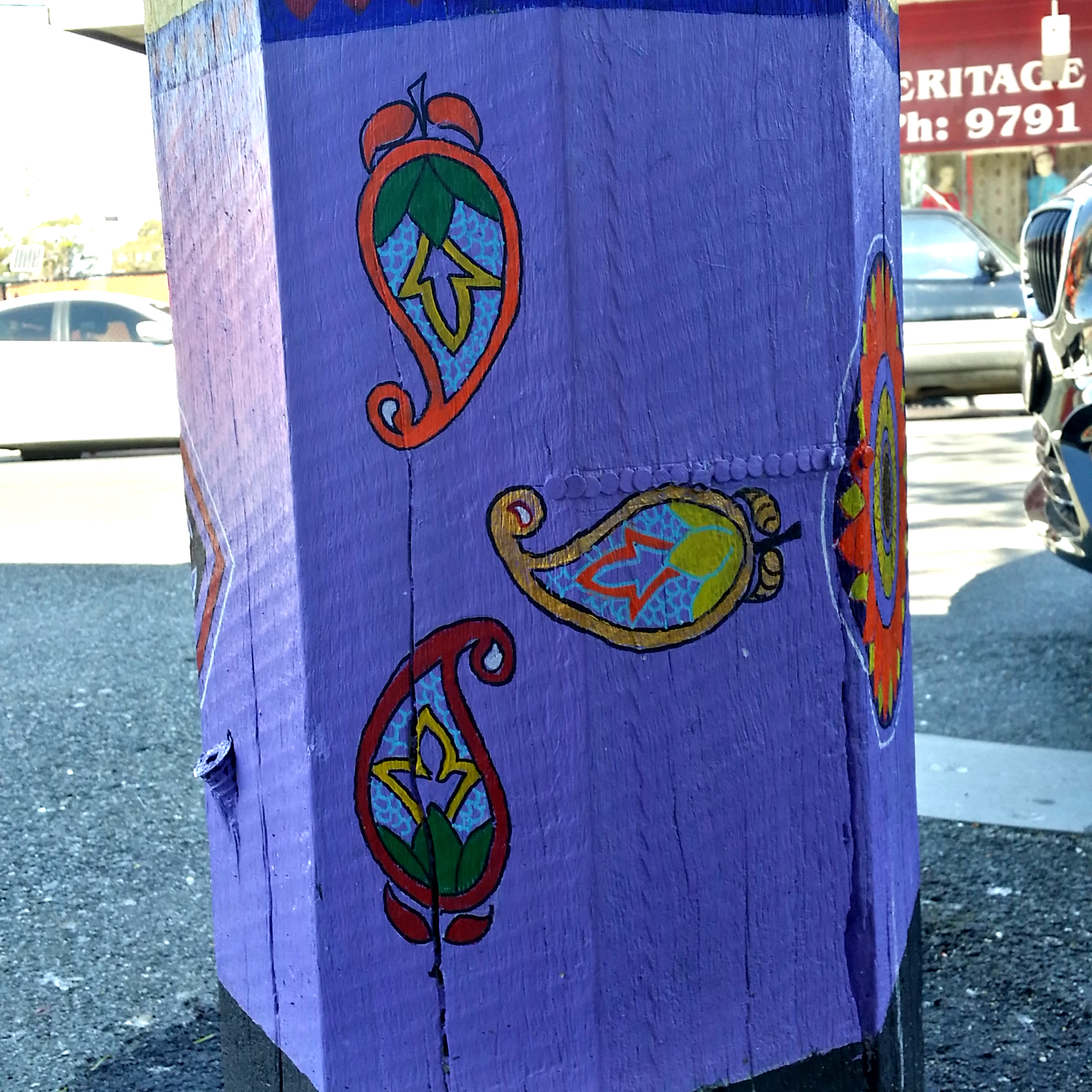
The bottom layer comprises of a Pakistani “Ajrak” inspired pattern on one side and Sri Lankan Lotus (Nelum) flower pattern at the other end with ‘Paisley’ motifs in the middle. These patterns have key historical and cultural significance for the region.
Ajrak is the traditional part of attire for Sindhi people in Pakistan; and the tradition of printing and wearing ajrak goes back thousands of years. The use of rich crimson color with bits in black and white to give definition to the design is a key characteristic of ajrak pattern. Similarly, the Lotus motif takes a prominent place in Sri Lanka’s decorative art and is a symbol for enlightenment (nirvana) in the traditions of Sinhalese people.
Though named after a Scottish town, the classical teardrop pattern ‘Paisley’ motif has its roots in the Indian subcontinent as well and is common to all cultures living in the area. Depending on the region, this common pattern is named; Kalka (Bengali), Kerii (Urdu/ Hindhi), Ambi (Punjabi) or Buta (Persian) and has been known to be inspired by the shapes associated with floral sprays, cypress trees, mangoes, figs and almonds.
Putting it together
Once the project was awarded, I meticulously planned the artwork into a detailed scaled drawing with the intent that I wiould transfer the design on to the pole directly. My initial thoughts were to work through the process as a campaign and finish the piece in 4 days with 10-12 hour stints each day.
The wooden ‘octagonal’ pole was not as receptive to the transfer of the design as a piece of canvas and this took additional time to work through. However, it was on day 3 when the main disaster struck.
Day 1 and Day 2 were cold but manageable, with bouts of sunlight and freezing winds, however, Day 3 was humid and it eventually rained resulting in damage to the artwork and forcing me to abandon the campaign.
Having been betrayed by the weather once, the Bureau of Meteorology website become my best ally as I re-planned to commence my days around sunshine and low humidity. It took several more days of hard work until I was eventually able to complete the piece.
Working in the open, exposed to the environment and the audience was an interesting experience. The feedback was instantaneous and mostly positive and encouraging. People passing by took time out to view and compliment the works and even photograph me painting the pole. In one instance a frail old lady was so happy to see the peacock painting that she was full of praises for the council and me for providing her an opportunity to experience live art. Similarly, in another incident a Sikh gentleman was so enthusiastic that he offered to have tea and samosas with me. During our brief conversation he humbly requested me to add a slogan in Punjabi on the pole to go with the other languages and when I acknowledged that I didn’t know the language he wrote ‘Sat Sri Akaal’ in Punjabi on a piece of paper so that I could add the slogan on the pole. This occurred on the very last day and though I was keen to finish the work, , I was so humbled by the experience that I was happy to take some extra effort to incorporate the requested Punjabi greeting in the design.
All in all it was a good learning experience for me, and I hope that as long as the artwork stays in the location it will continue to bring joy among its viewer and propagate a sense of openness and appreciation for the various cultures and people it represents.


